Is your cluttered website killing sales?
Updated almost 9 years ago. Categories: Help, Images
Do you ever come across websites so cluttered that you can’t find your way around? Unfortunately it’s a very common problem. It starts innocently enough when you put a banner or two up to advertise an upcoming show, then a few spinning email links, then a banner or two for all the Clubs and Associations you support then hit counter and so on, but soon it grows into a cluttered mess and people can’t find what they are actually looking for… your creations for sale.
The problem is even worse these days with the large amount of “free” websites that plaster ads all over your site. That doesn’t sound very free to me. While we are on the subject of ads, it’s bad enough to see ads on a “free” site but if you are paying to be on a website and that website is covered in ads for everything except your creations, then you are being ripped off.
“Clutter” can also be in the form of your websites design. Do the colours go together or do they clash? Is there a set layout or does stuff just appear all over the page? Are the fonts readable? Is there distracting flash animations and so on. These can all contribute to lower sales.
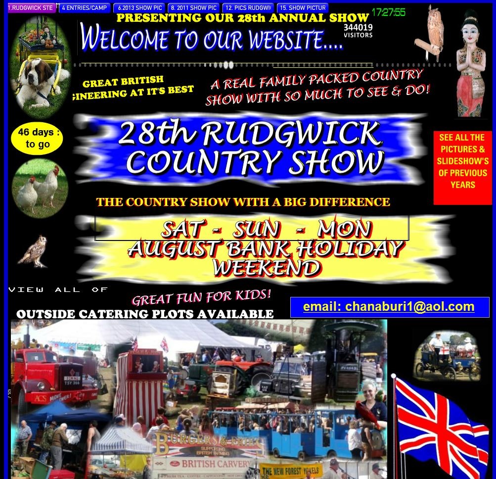
This page is just far too cluttered and is full of distractions. Have a clear purpose for every page and get rid of everything that isn't essential.
So what should we be aiming for?
Decide what each page is for.
Ideally each page of your website should serve one purpose and one purpose only. If that page contains your artistic creations that you are trying to sell, then your artwork needs to be the only focus. The images, colours and text should all be for the same purpose, selling your art. Every other banner and ad serves to distract people. Worse still, what if they actually click on one of those ads and leave your site entirely? There’s a sale lost right there.
Pick a simple colour scheme that enhances whatever it is you are trying to sell without distraction. Complex background patterns, especially ones with animations should be avoided at all costs. Keep things simple. Use complimentary colours too. Sites like coolors.co and ColorShemeDesigner.com will allow you to choose a core colour then give you a range of complimentary colours that suit. They are well worth trying.
Use fonts that go together. Nothing looks worse than mismatched fonts that simply don’t work together. Pick two, maybe three fonts that go well together and stick with those. Also, don’t use a million different font sizes. Do a quick search on font combinations and you’ll find plenty of helpful sites like typography.com and creativebloq.com

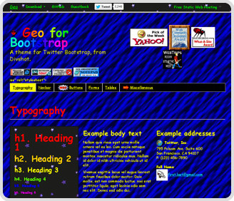
Here’s a great example of a simple web page that leaves you in no doubt as to what it is about. The colours are subtle and muted, there is no unnecessary banners, ads & buttons and everything is clear and concise. The item for sale is by far the largest image on the page so this gets all of the focus. The other elements at the bottom are for similar items for sale, not unrelated ads & banners. This is what you should be aiming for. Simple and uncluttered.
In conclusion.
What to avoid:
- Unnecessary elements.
- Confusing colour palettes.
- Distracting backgrounds.
- Mismatched fonts.
- Ads.
What to aim for?
- A consistent colour palette.
- A consistent font palette.
- A clear purpose for every page and for everything on the page.
Web design is a huge topic that can be quite daunting. hopefully some of these tips will help you with you ultimate purpose, selling more of your art. Do you have any tips you’d like to pass on too? Head over to our facebook page & leave a comment. We’d love to know what you think.
